 Why choose Breeze
 Marketing
 Creative
 Sales
Sales Remote work
 Managers
 Product teams
 Project management
 Task management
 Kanban tool
 Time tracking
 Project reporting
 Project calendars
 Project timeline
 Team workload
 Project automation
 Project customization
 Chat
Chat Web forms
 Project roadmap
 AI
AI What's new
 Articles & guides
 Help center
 Mobile apps
 Integrations
 Developers & API
 Free tools
New in Breeze: focus mode, and a task window that fits your screen

Two things shipped today, and they solve the same annoyance from opposite ends. You can now make the task window wider - three sizes, and Breeze remembers the one you picked. And you can expand any single part of a task to fill the whole window, hiding everything else, so a long description or a pile of to-dos gets the room it needs.
Neither changes how Breeze works. Your board is the same, your teammates see the same thing. It is just that the task window stopped being one fixed size for everybody.
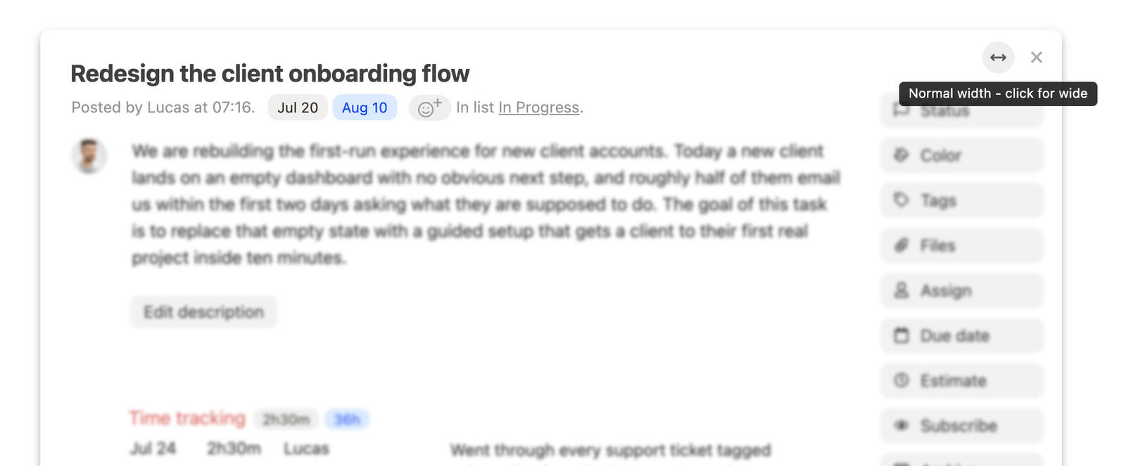
When one task needs more than a narrow column
The task window has been the same width since we built it, and for most tasks that is fine. A title, an owner, a due date, a couple of comments - it fits.
The trouble starts with the tasks that carry real weight. A specification written out properly, read through a column narrower than a phone screen. A to-do list of thirty items where every name wraps onto a second line. A week of time entries where the description column is so thin that "please review this content on dv1 before I turn it over to the client" turns into four lines of text.
None of that is broken, exactly. It is just cramped, in a way that quietly pushes people to write shorter descriptions than they should, or to keep the real detail in a document somewhere else. The window was the constraint, and there was nothing you could do about it.
Three widths, and it remembers yours
There is a small arrow button in the top right corner of the task window now, just left of the close cross. Click it and the window cycles through three sizes: normal, wide, and full. Click again to come back around.
Everything inside grows with it - the description, the comments, the to-do lists, the time entries. The person column in time tracking gets a bit more room too, so names stop truncating, and the space left over goes to the description rather than sitting empty.
The size you pick is saved to your account, so it survives a reload and follows you to your next task. It is yours alone: nobody else on the team sees a different layout because you went full width, and nothing about the task changes.
On a smaller laptop the two larger sizes stop growing once they reach the edge of the screen, so full width never means a window you have to scroll sideways to read.
Full screen for one thing at a time
Wider helps. But sometimes the problem is not that the window is small - it is that a whole sidebar of buttons and half a dozen other sections are competing for your attention while you try to write one paragraph.
So most parts of a task can now be expanded on their own. Hover over the description, a comment, the to-do lists, time tracking or estimates, and a small expand icon appears. Click it and that one block takes over the whole window. Everything else - the action rail down the side, the other sections, the other comments - gets out of the way until you close it.
Focus opens at the wide size regardless of what you normally use, because that is the comfortable reading width for prose. The width button stays live while you are in there, so if you want the full width for a wide to-do list, it is one more click.
To come back, hit the close button in the top right of the block or press escape. Escape only exits focus - it does not close the task out from under you. A second press closes the task, the same as it always did.
What full screen is actually good for
It sounds like a small thing. In practice it changes which of these parts of a task you are willing to use properly.
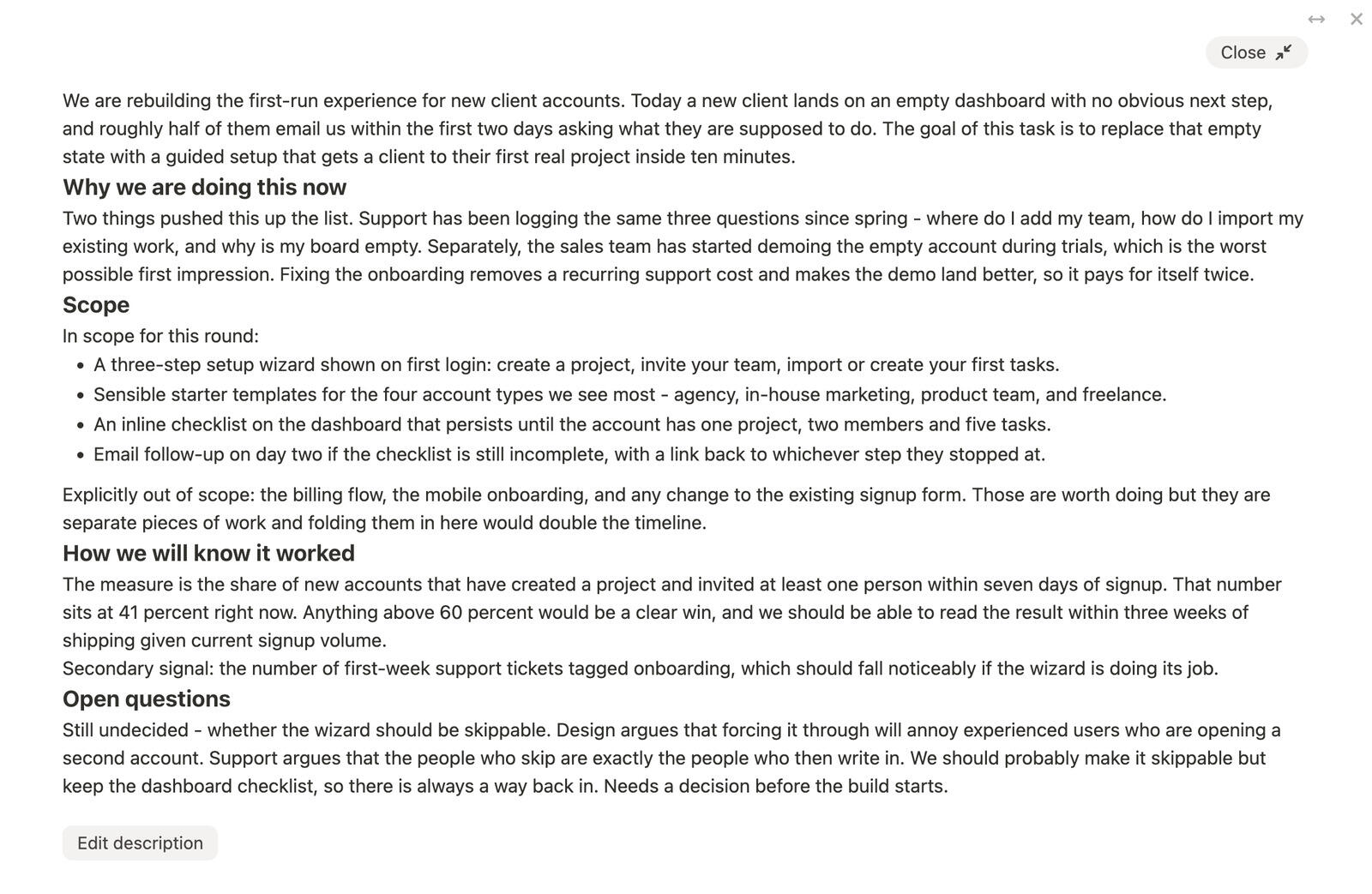
Writing a description someone will actually read
This is the obvious one. A brief, a spec, an acceptance criteria list, the background on why a decision went the way it did - all of it is easier to write and much easier to read across a full-width column with nothing else on screen. Expanding works while you are editing too, so you can start typing at the normal size and open it up when you realise the thing is going to be longer than you thought.
The practical upside is that people stop offloading detail into a separate doc. The context lives on the task, where the person doing the work will find it.
Reading a week of time entries
Time tracking and estimates both expand, and both get noticeably more useful with the extra room. Full width gives every entry its date, its hours, its person and its full description on one line, so a week's worth reads as a list instead of a paragraph.
If you bill for your work, this is the view worth knowing about. Checking what got logged against a task before an invoice goes out is a lot faster when you can read the descriptions without hovering over each one. There is more on how the numbers roll up in time tracking.
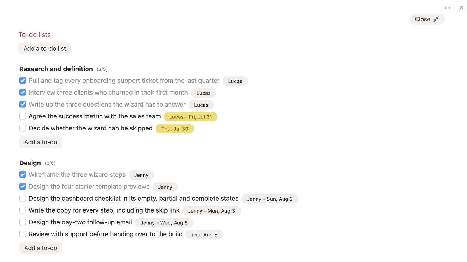
Seeing every to-do list at once
Expanding to-do lists brings up all of them together, not just the one you clicked. On a task that has broken down into a pre-launch checklist, a QA pass and a handover list, that is the first time you get to see the whole thing on one screen without scrolling past the description and the comments to do it.
It is a better place to tick things off, and a much better place to answer "how much of this is actually left" - which is usually the question you opened the task to answer.
One comment, on its own
Any single comment can be expanded, and so can the comment box while you are writing. Useful for the long ones - the handover note, the round of feedback with eight points in it, the reply you want to get right. Everything else in the discussion disappears while you deal with that one thing.
Notes and messages got the same treatment
The width control is not only on tasks. Project notes and project messages have their own arrow button and their own three sizes, and each one remembers its own setting - a wide notes editor does not drag your task window wide with it.
Notes benefit the most, since it is the place people write at length. The note list on the left grows a little at the larger sizes, enough to stop long titles truncating, and the rest of the space goes to the editor where you need it.
What stays the same
Worth saying plainly, because layout changes make people nervous:
- Nothing moved. Every section is where it was, the keyboard shortcuts are unchanged, and the normal width is the exact width the task window has always been. If you never touch the arrow button, nothing about your day is different.
- It is per person, not per team. Your width is your width. Your teammates keep theirs.
- Focus mode is temporary. It is not a setting - it lasts until you close it, and the next task you open comes up normally.
- Phones are untouched. The phone layout already gives a task the whole screen, so none of this applies there.
Common questions
- Where is the width button?
- Top right corner of the task window, immediately left of the close cross. It looks like a horizontal arrow. Hovering over it tells you the size you are on and the size the next click gives you.
- Does my width setting change what my team sees?
- No. It is saved to your account only. Two people can have the same task open at different widths and neither notices.
- Which parts of a task can be expanded?
- The description, any single comment, the comment box while you are writing, time tracking, estimates, and the to-do lists. The expand icon shows up when you hover over one of them.
- How do I get out of full screen?
- The close button at the top right of the expanded block, or the escape key. Escape leaves focus without closing the task.
- Can I still edit while a section is expanded?
- Yes. Descriptions and comments can be written and saved in full screen, and you can expand a block that is already open for editing without losing what you have typed.
Give the work some room
The short version: if you mostly work in short tasks, take the wider window and forget the rest. If your tasks carry long descriptions, deep checklists or a lot of logged time, focus mode is the part worth trying first.
Open a task you have been meaning to write up properly, hover over the description, and click expand. It takes about two seconds to find out whether it suits how you work. There is more on the rest of the task window in our help pages.