
 Why choose Breeze
 Marketing
 Creative
 Sales
Sales Remote work
 Managers
 Product teams
 Project management
 Task management
 Kanban tool
 Time tracking
 Project reporting
 Project calendars
 Project timeline
 Team workload
 Project automation
 Project customization
 Chat
Chat Web forms
 Project roadmap
 AI
AI What's new
 Articles & guides
 Help center
 Mobile apps
 Integrations
 Developers & API
 Free tools
New in Breeze: notification emails you can read without opening them

Most people meet Breeze in their inbox before they meet it in a browser. A task gets assigned, a due date moves, somebody leaves a comment - and the first you hear of it is an email on your phone, read in a queue somewhere.
Those emails have been rebuilt. The short version: the thing that happened is now readable in the email itself. The task name, where it lives, who changed what, and the actual words somebody wrote. Before, you mostly got a list of links and had to open one to find out whether it mattered.
Nothing has been switched on or off. If you get Breeze email today, you get the same email about the same events - it just looks like this now.
The task comes first
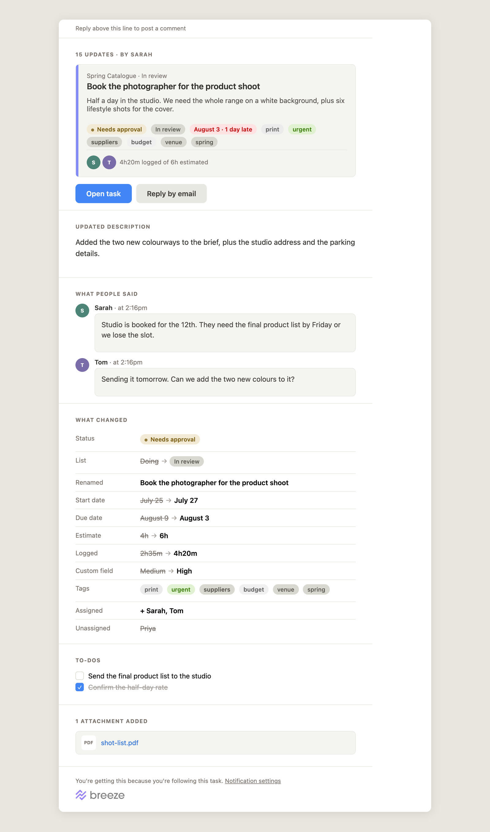
Every email about a task now opens with the task itself: its name, the project and list it sits in, its description, and the tags, status and due date it currently carries. The coloured stripe down the side is the task's own colour, so a board you know is recognisable from its email.
That block does a specific job. It answers "which one is this?" before you have read anything else. If you work across four projects with a task called "Send the invoice" in three of them, the crumb line above the name is usually all you need.
Underneath it, the people on the task, and the time logged against the time estimated - the two numbers people most often open a task to check.
What changed, as a list of changes
The old emails described changes in sentences. The new ones show them as a table: the field on the left, the old value struck through, the new value in bold. Status, list, dates, estimate, time logged, custom fields, tags, who was added and who was taken off.
It is a small thing that turns out to matter a lot on a phone. "Due date August 9 → August 3" is one glance. The same fact in a sentence is a paragraph you have to read to the end of.
Only the fields that actually changed appear. A task where somebody moved one date produces four lines, not an empty form with fifteen rows in it.
The daily recap, grouped by project
If you have the daily or hourly recap switched on, it now opens with the numbers - how many tasks moved, how many are new, how many comments, and how much time was logged - and then breaks the detail down by project.
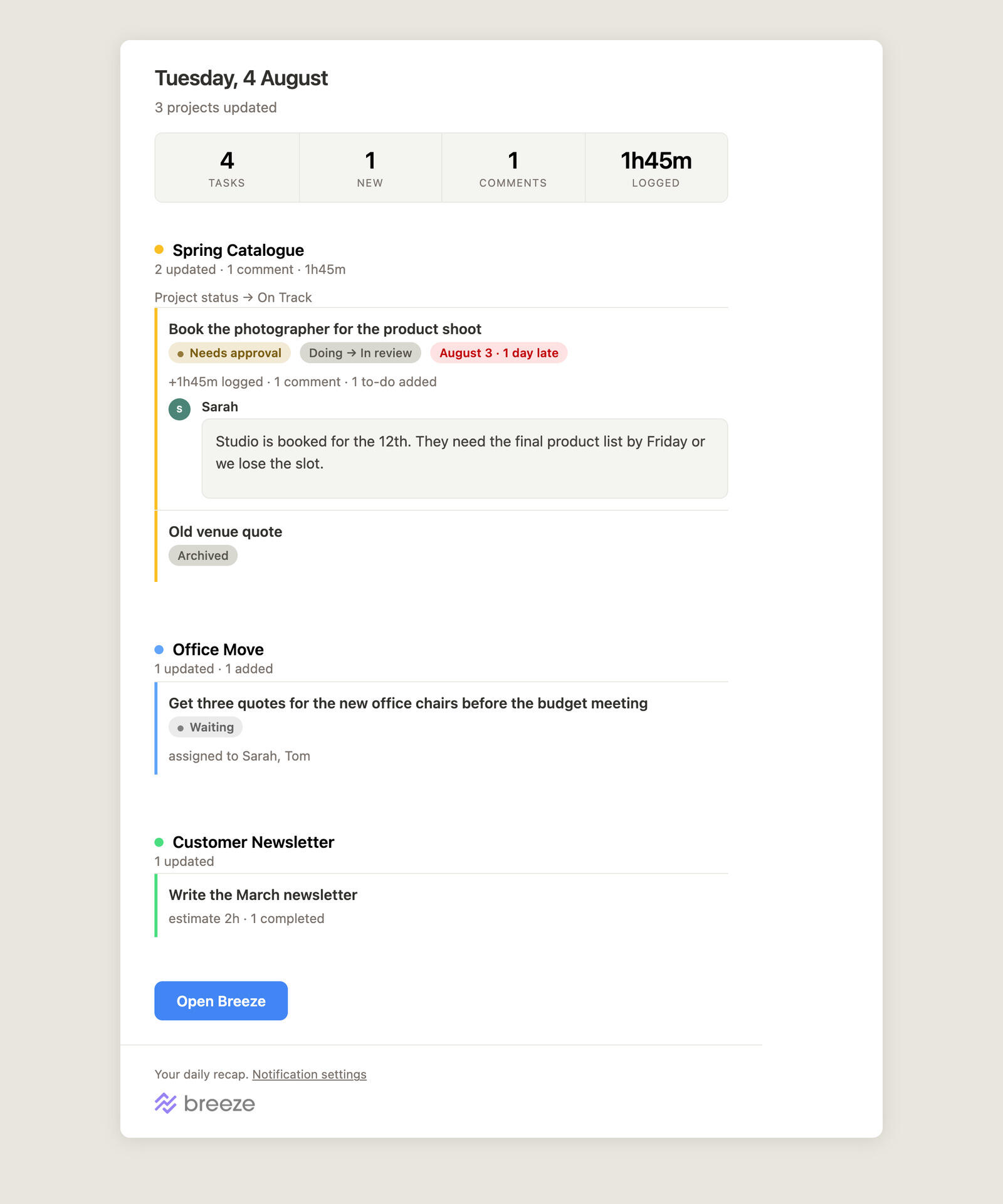
Each project keeps its own colour dot and a one-line summary, and its tasks sit under it with the chips that describe them. Project-level news - a status change, files added to the project rather than to a task - shows up in the same place.
Two smaller changes came out of using it. Logged time drops out of the totals when nobody tracked any, because "0h" is not worth a quarter of the width. And a recap with genuinely nothing in it is no longer sent at all, rather than arriving empty.
Every other email got the same treatment
The redesign covers the whole set, not just the two above:
- Assigned to you and new task - the task block, so you can tell whether it needs you now.
- Due today and tomorrow - your tasks grouped by project, with to-dos due in the same period underneath.
- Mentions - the message you were mentioned in, quoted, with a link to where it lives.
- Weekly time report - the week's total, a chart by day, then time by project and by task.
- To-do assigned - which to-do, on which task, in which to-do list.
- Invitations and password resets - shorter, and clearer about what the link does.
The parts you should not notice
Some of the work went into things that are only visible when they are wrong.
Every email now carries a plain-text version generated from the same content, so mail apps that do not show HTML - and the accessibility tools that read your mail aloud - get the whole message rather than a stub. Long task names and pasted links wrap instead of pushing the layout sideways. The colours are the same ones the app uses, so a tag is the colour you chose. And the emails are built to survive Outlook, which quietly ignores a lot of what modern email design assumes.
Nothing about permissions changed. Emails to clients and observers still leave out what those roles cannot see in Breeze itself.
If you want less of this
All of it is still controlled from the same place: your profile settings, where you can turn individual notifications off, switch the recap between daily and hourly, or stop it entirely. Every email has a link straight to that page in its footer.
Nothing to do
The new emails are live. The next time something happens on a task you follow, you will get one - and with any luck you will be able to tell whether it needs you without leaving your inbox.
If one of them looks wrong in the mail app you use, tell us which app. That is genuinely the useful part of the report.



Comments you can read in the email
Comments are quoted in full, with who wrote them and when. If two people had a short exchange on a task, both halves are in the email in order, so the thread reads the way it read in Breeze.
You can also just reply to the email. Your reply is posted as a comment on that task - it always could be, but the line at the top of the email now says so, and there is a Reply by email button next to Open task for when you are on a phone and would rather not switch apps.