What makes project management software truly simple
Contents
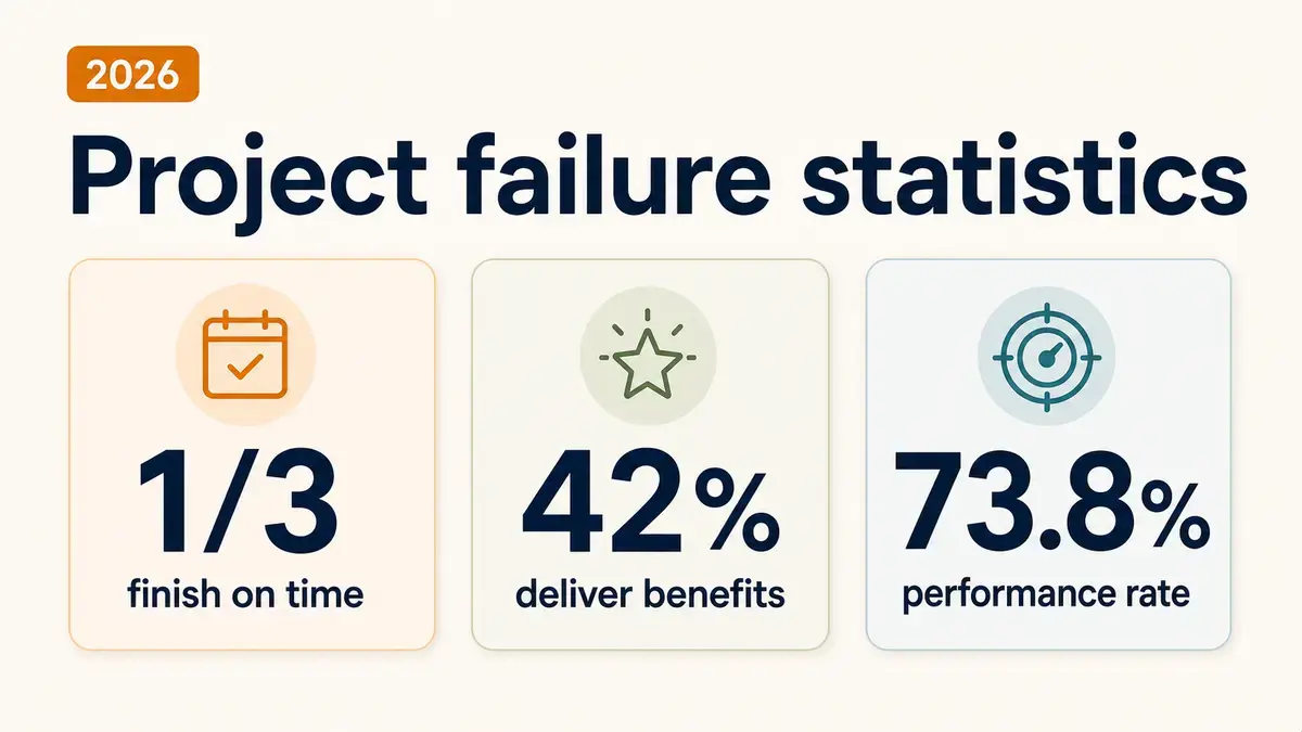
When teams choose project management software, they expect a simple tool that speeds up work. Teams pick project management software to speed up workflows and help them manage projects. Yet complex tools slow teams down. Long onboardings take too much time that could be spent working. Extra fields and reports turn into daily admin. Files, comments, and updates spread across tabs, so decisions take longer and mistakes creep in. The result is slower delivery, lower adoption, and missed deadlines.

Many tools call themselves simple project management software, but they still pack in extra views, modes, and settings that small teams do not need. The screen feels crowded, and the basics get lost. New users hesitate, and the tool turns into more work instead of less.
Here, we break down what real simplicity looks like (in easy project management tools) and how to spot it before you commit. You will see the core traits of simple software, the user experience (UX) patterns that keep work moving, and a quick checklist to test any tool for speed and clarity. By user experience, we mean how people interact with the tool, how clear the interface feels, and how quickly tasks can be completed. The goal is for people to learn it quickly and make it part of their daily work.
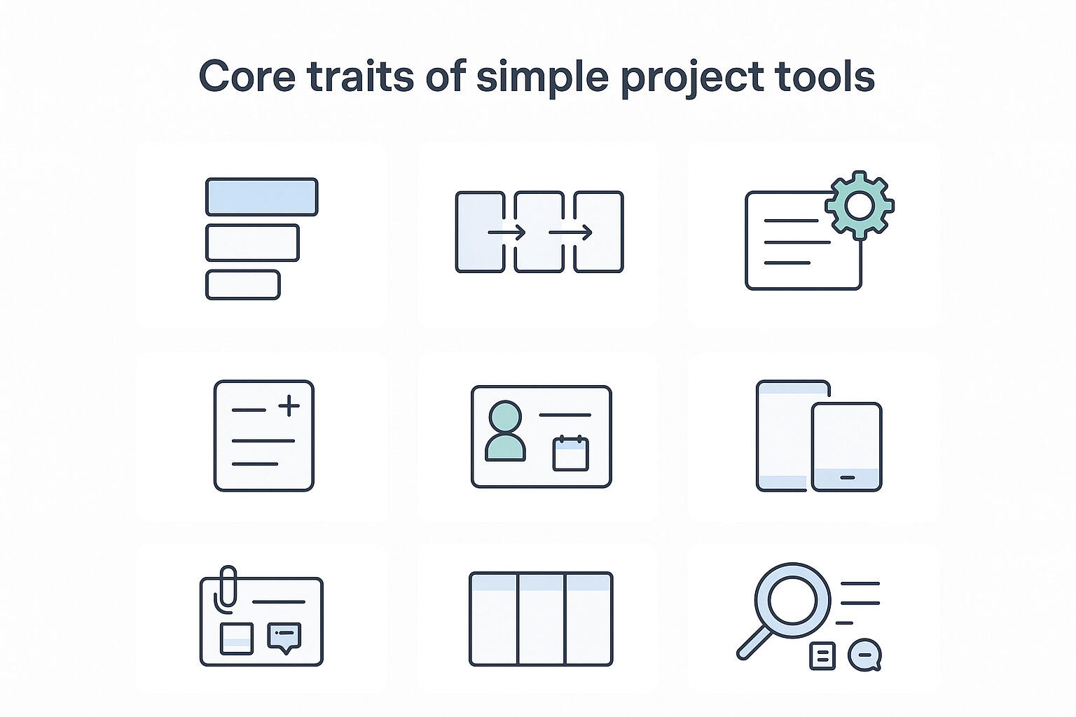
1. Core traits of truly simple project management software
Simple tools make the next step obvious, keep context close, and reduce clicks. Use this list to check how a product behaves in real work, not just in a demo.
- Clear information hierarchy that highlights current work and upcoming deadlines
The first screen should show what is active today, what is due soon, and what is blocked. Labels, dates, and owners are readable at a glance. Clean project boards make this easy. Status pages and reports are helpful, but the daily view should make it clear what matters right now. - Predictable navigation across boards, lists, and calendars
Switching between views should always feel familiar. Tasks open the same way, filters sit in the same place, and names are easy to read and understand. - Minimal fields with smart defaults
Creating a task should be quick. A title, an owner, a date, and maybe a short note is enough. Common details can fill in automatically, and extra fields should stay optional or hidden. - Fast task creation and quick edits
You should be able to add a task from any view without loading a new page. Titles, owners, and dates should update right where they are. Bulk actions should handle repeats so you don't waste time on routine changes. - Ownership and dates are visible at a glance to reduce status chasing
Every card shows who owns it and when it is due. Overdue items are clearly marked. If someone needs help, you can see it in the same view. This supports project success factors and keeps stand-ups short. - Same actions on mobile and desktop
Basic tasks should work the same on phone and laptop. You can add a task, change the owner, set a due date, or leave a comment without a workaround. Mobile does not need every advanced setting, but it should handle the daily flow so people can keep working away from their desk. - Context stays with the task
Notes, files, and decisions should live in one place. You should not need to open extra tabs to find the latest draft or review. When a task goes to review, the full history is right there. - Defaults that match real use
The setup should make sense as soon as you start. Boards, lists, and calendars should have clear names. You can begin right away and adjust later, instead of building a system before doing any work. - Search that actually works
Search should find tasks by title, label, person, or date. It should also return attached files and the comments where decisions happened. Results should rank well, filters should be quick to use, and search should also catch linked docs or noted project risks. - Rules that are easy to explain
Rules should be easy to set and explain. If you need a diagram to explain a rule, it is too complex. Clear rules mean fewer errors and less time spent on support.
If a tool meets most of these traits, it will likely fit a small team without extra training. If it misses them, you will see longer onboarding, scattered context, and stalled handoffs. Next, we cover the UX patterns that make the difference in day-to-day work.
2. UX patterns that keep work moving
Good UX lets people add work fast, see what matters now, and get context in one place. Use this section to spot patterns that speed teams up, and avoid those that slow them down.
Fast capture and quick edits
Speed starts with how fast you can add or change a task. Bad UX makes you open a long modal with required fields you do not need, then jumps you to another screen when you hit save. Inline edits are disabled, so every small fix becomes a new page. Good UX lets you add a task from anywhere, edit the title, owner, and date in place, and use bulk actions for repeats. On project boards, you should drag, drop, and tweak without losing your spot. The result is simple: less typing, fewer clicks, and a record that stays current because updates take seconds, not minutes.
One-page clarity for each task
Bad UX spreads files, comments, and decisions across tabs, chat, and email. People chase links and miss details. Good UX keeps the brief, attachments, and history on the task page. You can see what changed, who approved it, and which file is final. Reviews are quicker, handoffs are smoother, and new teammates can follow the thread without extra guidance.
Ownership, dates, and status up front
Assignees and due dates should be hard to miss. Bad UX hides them or floods the board with too many statuses. Good UX shows owner and date on every card and uses a short, shared set such as To do, In progress, Review, and Done. Overdue items are clear. This cuts "any update on this" messages and makes reviews and project proposals easier to evaluate in context.
Collaboration that stays on the task
When feedback gets scattered across chat, email, and folders, tasks end up empty and context is lost. A better setup keeps comments, mentions, and files on the task itself. You tag the right person, attach the draft, and decisions stay connected to the work. By the time it reaches review, everything is in one place, so the reviewer can act quickly.
Notifications that matter
Too many alerts turn into noise, and people stop paying attention. Useful notifications highlight real actions, like "you were assigned this task" or "your review is needed." Extra pings can be muted by task or project, while a daily or weekly digest handles low-priority updates. The result is focus on blockers, not clutter.
Workflow flexibility without losing ease
Flexibility matters, but not if it makes the tool hard to use. Bad UX forces rigid structures, deep role matrices, or complex dependency maps for simple work. Good UX adapts to how people already work with clear patterns: drag-and-drop boards, a simple timeline for dates, and an obvious task hierarchy. Keep statuses short and defaults sensible to project scope management while keeping the flow easy to understand.
Practical examples of bad vs good
| Category | Bad UX | Good UX |
|---|---|---|
| Task creation | Asks for template, workflow, priority, watchers, goals, and dependencies before you can write a title. | Accepts a title, owner, and date, then lets you add more later. |
| Editing | Opens a new page for tiny changes. | Supports inline edits and bulk updates on the current view. |
| Files and comments | Splits files into a tab and puts comments in chat. | Keeps both on the task, with the latest version obvious. |
| Navigation | Changes controls between boards, lists, and calendars. | Keeps patterns the same, so you do not relearn the tool when you switch views. |
| Status | Offers dozens of statuses that mean different things to different people. | Sticks to a small shared set so everyone reads it the same way. |
Tie-back to evaluation
Use these patterns as a quick test. Open a live project and try to add a task, assign it, set a date, attach a file, and leave a comment in under one minute. Switch between board, list, and calendar. If you feel lost, if fields get in the way, or if edits take you to new pages, the UX is adding drag. A simple tool will pass this test and keep your project plan template light, your views predictable, and your daily work moving.
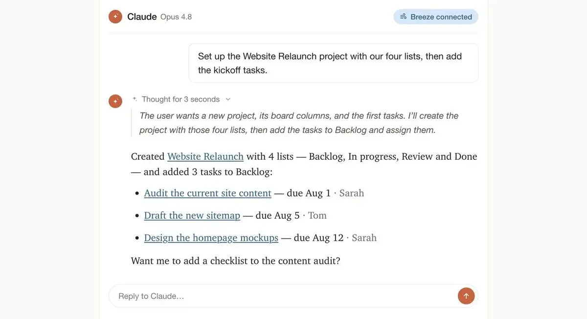
3. How Breeze supports a simpler workflow
With Breeze, tasks and projects are easy to create and manage without training. The interface shows only what you need, so people can add a task, set an owner, and add a date in seconds. Boards, lists, and calendars share the same patterns, so your project plan looks and feels consistent across views. You can switch views and still know where filters, dates, and owners are. For example, imagine you are a marketing manager adding a campaign task on mobile - it should take seconds, not minutes.

Context stays on the task. Comments, mentions, and attachments live together, so the latest file and the discussion are in one place. Reviews move faster because the reviewer opens a task and sees the brief, drafts, and decisions without switching screens. Ownership and due dates are visible on every card, which keeps handoffs clear and cuts status chasing. Picture a designer attaching a draft and tagging a teammate directly on the card - the reviewer sees everything in context right away.
Workflows feel natural rather than forced. Columns match how your team works. Checklists cover small steps. Labels help you group work by client or channel when needed. You turn on only what helps the project, so the workspace stays light and avoids scope creep. Adding a task takes a few seconds: title, owner, and date. Reviews start on time because the file and comments are on the task.
Takeaway
Simple project management software makes planning, tracking, and delivery easier. They reduce setup time, help people start fast, and keep information in one place. If your stack adds steps to every action, you will see slow onboarding and scattered context.
Run a quick check on your current tool:
- Add a task, assign it, set a date, attach a file, and leave a comment in under one minute.
- Find the owner, due date, and latest file for any task in two clicks.
- Ask a new teammate to start without a guide. Aim for under an hour.
- Track admin time for a week. If it is high, remove layers you do not use.
Choose lightweight project management software that is easy to learn, keeps owners and dates visible, and holds comments and files on the task. Breeze follows these principles so teams can collaborate effectively.